


We took a little time to go over basics of CSS, we have our HTML skeleton, now we'll add some styling to the blog based off what we learned, and include a few new things, like media queries. To put it simply, @media rules allow you to use different styles for different sized devices (desktops, laptops, tablets, phones etc.) This is a key piece of responsive web design.
On to the Blog!
First things first, your repo may be out-of-date if you are following along, as I've made some updates. You can review the changes to the index.html and style.css files, and also note a new folder structure: assets/images The assets folder is where we will store all of our..well..assets, such as fonts if we choose to host them, images, even the css can move to this folder in time.
HTML Key Changes:
You'll mostly notice that I have added some filler text for sections in the HTML file. The first one being the "About" section:
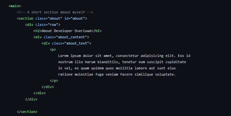
A common theme in building web pages and applications is using filler text called "Lorem Ipsum." I like to use this generator which also explains what Lorem Ipsum is.
The next section change to review is the "Work and Projects" section:
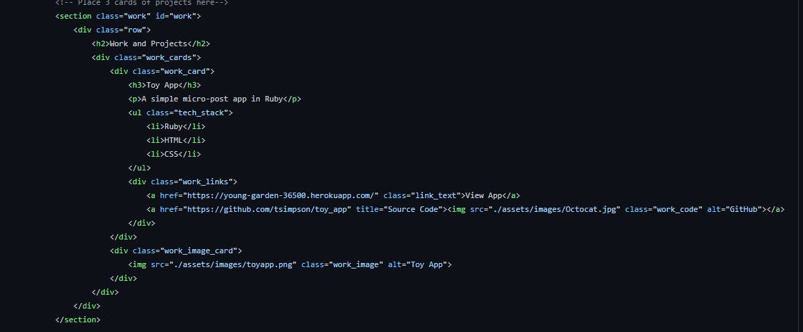
You'll notice the same project linked 3 times. This is just a simple place holder until we get our projects set up to fill out the space. If you review a little closer, you'll also notice a "potential bug" that I happened to just notice while writing this article :) I'll let you look over it and see if you can find it before we correct it later on.
Finally, towards the bottom, we have the "Blog" and "Footer" sections:
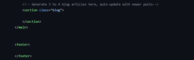
These are empty for now. As we move forward, we'll hard-code some data in to the blog section, and look at different layout ideas for the footer. For now, we're going to focus on styling the Header, Nav Bar, About and Projects sections. To keep things fairly simple, we'll probably follow similar styles in the Blog section as we have for the Work/Projects section.
As an aside: feel free to use the images in my file, or find some images for your own projects if you have some to display, or make up some fake ones to fill the space for now. Check out sites like unsplash for some nice, free images to use!
Moving forward, let's review the css file in its current state:
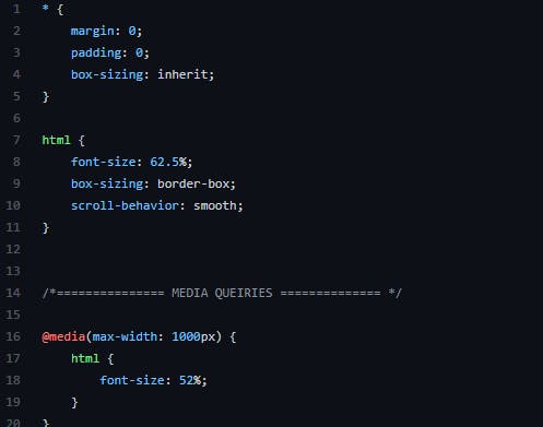
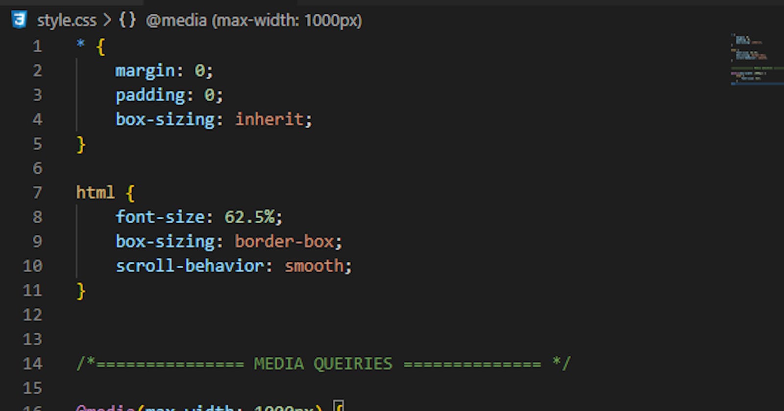
We start with styling using the * selector. We set the margin and padding to 0. We set box-sizing to inherit which allows following elements to use their own box-sizing, with child elements following the parent box-sizing. We may go ahead and add a line-height of 1 and maybe even font-size of 100% here. This section is called the css reset. Some may say it's not necessary, and to a certain extent it's not, but it's nice to have a clean slate with a baseline to work from. There are tons of different css reset styles to try out. Run a google search for them and try out different ones to find what works best for you.
Following the * selector, we move on to html selector. This one sets everything under the html tag to it's styles. We're using a font-size of 62.5% (not a hard number to stick to, and we can adjust to our needs, but we'll see how it all comes together soon!) The purpose of a % is to allow it to easily scale with the device size. We adjust box-sizing to be border-box. As defined by W3Schools, the border-box style:
The width and height properties (and min/max properties) includes content, padding and border
Finally, we're adding a scroll-behavior: smooth; for a nice, smooth scrolling effect.
The last section to review is very brief. This is our first step in to media queries. We call @media(max-width: 1000px) to tell it to set the font-size to 52% when the screen is at 1000px or less. This might be a tad bit small, but adjustments we make moving forward will change that!
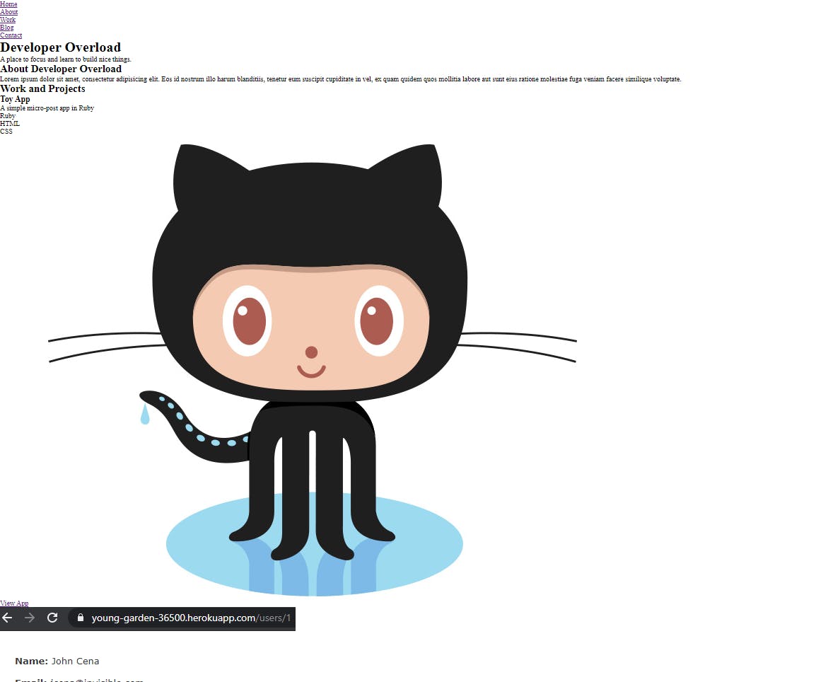
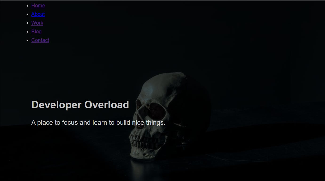
We put all of this together and our page will currently look like so:
Right... let's get to work on making it look more like a website and less like someone threw up their mom's spaghetti on their sweater.
We're going to add in a pseudo-class selector, something we mentioned before but didn't dive in to. Let's add the :root selector to the file. This selector is similar to the html selector, except that it's specificity is higher. We're adding to our baseline elements, but we'll primarily use these as variables to access in styles to other elements.
:root {
    --font-size-small: 1.8rem;
    --font-size-normal: 2.2rem;
    --font-size-medium: 2.8rem;
    --font-size-medium-1: 3.6rem;
    --font-size-large: 5.5rem;
    --font-size-huge: 7.5rem;
    --font-stack: 'Hk Grotesk', sans-serif;

    --line-height-normal: 1.7;
    --line-height-small: 1.2;

    --black: #000;
    --pink: #ff3258;
    --white: #f0e9f2;
    --white-1: #e5e5e6da;


    --container-max-width: 1180px;
    --container-normal-width: 800px;
    --container-medium-width: 700px;
    --container-small-width: 500px;

    --gutter-huge: 12rem;
    --gutter-medium: 6rem;
    --gutter-normal: 3rem;
    --gutter-small-1: 2.5rem;
    --gutter-small: 2rem;

    --border-light: 1px solid rgb(36, 35, 35);
}
Notice how there is a -- before each attribute? This is how we name variables in CSS. This way, if we want to access these styles easily for other elements, all we have to do is call, for example:
font-size: var(--font-size-small); It allows for some uniformity and ease of access throughout our styles, rather than trying to remember what we use where, all we need to do is reference our :root attributes. Let's style the body element using them:
body {
    font-size: var(--font-size-small);
    font-family: var(--font-stack);
    font-weight: 400;
    color: var(--white-1);
    line-height: var(--line-height-normal);
    background: var(--black);
    overflow-x: hidden;
}
If you're using Live Server to auto-load updates, you should already see the changes after saving the file. If not, refresh the page and check it out!
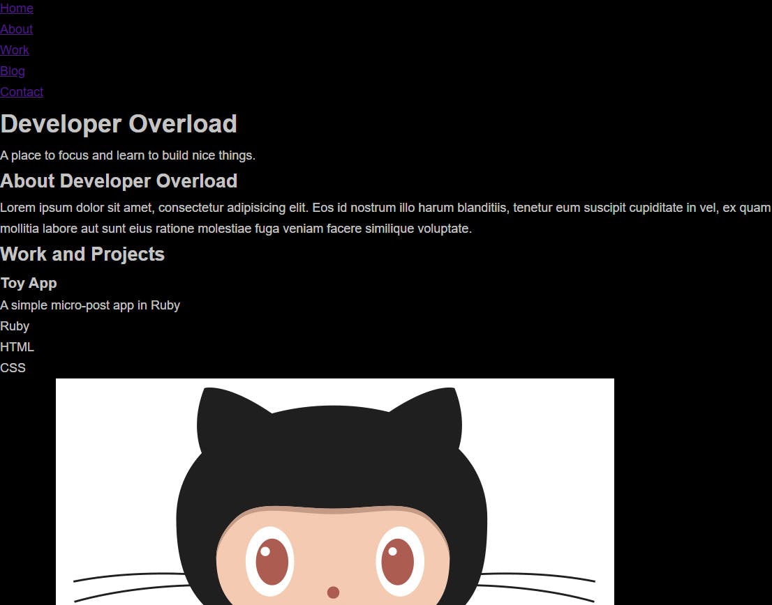
Now we're getting somewhere! Notice the font size and style changes, the background color, font weight and so on. It's still a long shot from where we want it to be, but progress is progress!
Let's finish this post off by making the navigation/header look more like a navigation should. We'll start by looking back at our html file to compare our elements and class selectors to see what we have to work with in styling.
We have:
<header>
<div>
<nav>
<ul>
<li>
<a>
<h1>
<span>
<p>

.row
.nav
.nav_items
.nav_item
.nav_link
.header_text-box
.header_text
.heading-primary
Quite a list to take on! But, it's not as painful as it may seem. Or it might be. /shrug
We're going to organize our CSS file to be easier to navigate, particularly important as we add more styling. notice how we have a comment /*=============== MEDIA QUEIRIES ============== */? Every Media Query is going to live under there. Note a "bug". I misspelled Queries in the file. Easy fix!
We're going to implement this for each section as well. Over-commenting is helpful, especially as we're learning to code! We'll create more comments like the above for: Header, Nav Bar, Work/Projects, About and so on. Each section of the page will have it's own commented section in the CSS file. This way if we want to go back and make an edit when our file is overly massive and difficult to scroll through, we need only do a search for "Nav Bar" for instance, to take us right to it in the file. If we need to fix a style on a specific device, we will know it lives under Media Queries and can quickly navigate to that section to make the change. More work now means easier maintenance later! Your future self will thank you.
Moving forward, to keep our base styles together, you'll note we have .row to edit in this particular section. Let's set some styles for that class now, as well as some media queries.
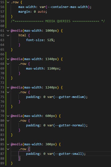
So on our baseline we've added a max-width of our earlier set variable --container-max-width and a margin of 0 auto. We've added media queries at 1340 for a max-width of 1100px, at 1240 we set our padding to 0 var(--gutter-medium) and increment to smaller settings at 600px and 300px.
Save the file, open your page up and open up developer tools. Select "Responsive" and adjust the screen size based on each max-width setting to see what happens.
The settings, for your convenience:

Notice that not just the heading/nav bar change? Look back at the html document and see where else .row is implemented.
While we're here, we're also going to add in a rule for img as we'll have an image in our header for our background:
img {
    object-fit: contain;
    max-width: 100%;
}
For the Header itself, here's what I want to do (and this may change in the near future!):
/*=============== HEADER ============== */
header {
    background: linear-gradient(rgba(0,0,0, .8), rgba(0,0,0, .5)),
     url(./assets/images/header.jfif);
    height: 100vh;
    background-size: cover;
    background-position: center;
    background-attachment: fixed;
    font-size: var(--font-size-normal);
}

.header_text {
    position: absolute;
    top: 50%;
    transform: translateY(-50%);
}

.header_text p {
    margin: 1.5rem 0 3.5rem;
    max-width: var(--container-medium-width);
    font-family: var(--font-stack);
    font-size: var(--font-size-medium);
}
For the background property, we're giving it a linear-gradient black background, but the more important part to look at in rgba(0,0,0, .8) as well as the other, is the last number. This is setting the transparency, allowing us to darken the background, but keep the image (linked by url(./assets/images/header.jfif);) visible. We set the height to 100vh, so it will always cover 100% of the viewport height, background size covers the view, with a center position, and we keep the attachment fixed, which makes for a neat scrolling effect.
On the .header_text we keep the position absolute so it moves with the page, top to 50% to keep it right about middle, and a transform of translateY at -50%, so it all comes together centered neatly.
We also want to style our <p> tag under the parent .header_text(important, we don't want to style all <p> tags this way!) We're going to give it a margin of 1.5 rem 0 3.5rem, so the margin adjusts relative to the size of the container we've given it in max-width, so if you look at your site and inspect element on your wording in your <p> tag, watch how the margin adjusts based on the width of your screen when you adjust it as we did earlier. This keeps it neat and responsive!
Finally, toss in a media query to adjust it on smaller devices:
@media(max-width: 500px) {
    header {
        text-align: center;
    }

    .header_text p {
        transform: scale(.8);
    }
}
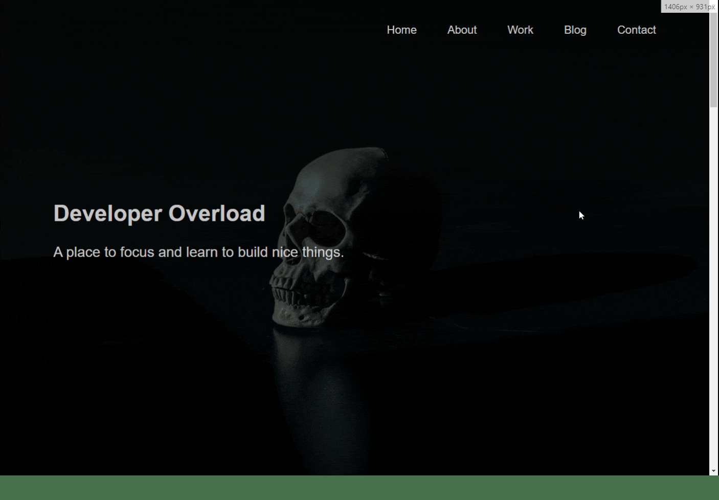
And now we have something that looks a little more like something:
Let's add some magical CSS to make the nav bar look more like an actual nav bar.
Nav Bar
Let's start off with editing the <nav> tag directly:
/*=============== NAV BAR ============== */

nav {
    display: flex;
    justify-content: flex-end;
    padding: var(--gutter-normal) 0;
}
Now we're diving in to some flex box, which is a fancy way to organize sections responsively. We give it a display: flex; to start, and justify the content to flex-end, which is going to shove it all to the end of the "flex box." Go ahead and safe your file and check out what happens to the nav bar!
Next, let's get rid of those bullet points:
.nav_items {
    display: flex;
    list-style: none;
}

.nav_item:not(:last-child) {
    margin-right: var(--gutter-medium);
}
The list-style: none; property gets rid of those pesky dots. The other interesting piece to look at is .nav_item:not(:last-child). The margin-right property is giving it our variable gutter-medium, but we're also specifying to not give this style to the "last child" on the list, in our case Contact.
We'll go ahead and add some media queries to adjust size and position on smaller devices:
@media(max-width: 500px) {
    nav {
        justify-content: center;
    }
}

@media(max-width: 400px) {
    .nav_item:not(:last-child) {
        margin-right: var(--gutter-normal);
    }
}

@media(max-width: 300px) {
    nav {
        font-size: var(--font-size-small);
    }
}
Now I still want to get rid of those underlines on the links as well, so we're going to do a bit more styling:
.nav_link {
    position: relative;
    display: inline-block;
    padding: 1rem 0;
    text-decoration: none;
    color: inherit;
    transition: all .2s;
}

.nav_link::after {
    content: '';
    position: absolute;
    bottom: 0;
    left: 0;
    right: 100%;
    display: inline-block;
    height: 1rem;
    background: var(--white);
    transition: all 0.25s cubic-bezier(1, 0.68, 0.16, 0.9);
}

.nav_link:hover {
    color: var(--pink);
}

.nav_link:hover::after {
    right: 0;
    height: 2px;
    background: var(--pink);
}
Here, we've done exactly what I wanted with removing those underlines..and added some flare for fun. We've adjusted the position, display, padding and color under .nav_link, and also added a text-decoration: none; to get rid of all the ugly stuff. We also added a transition: all .2s; to all items for our little display when hovering over the link. We have a special selector ::after, to input content after it is highlighted, but we don't want to put content so we leave that black. What we really want is to add in a little design for scrolling over the nav bar items, which is where our transition: all 0.25s cubic-bezier(1, 0.68, 0.16, 0.9); comes in. Our variable background transitions to the .nav_link:hover::after effect. So, if you save now and hover over each item you should see:
Now we're starting to look like a web page! Keep playing around with what you've got so far. In the next post, we'll finish styling our page, add some content and look to what's next!