

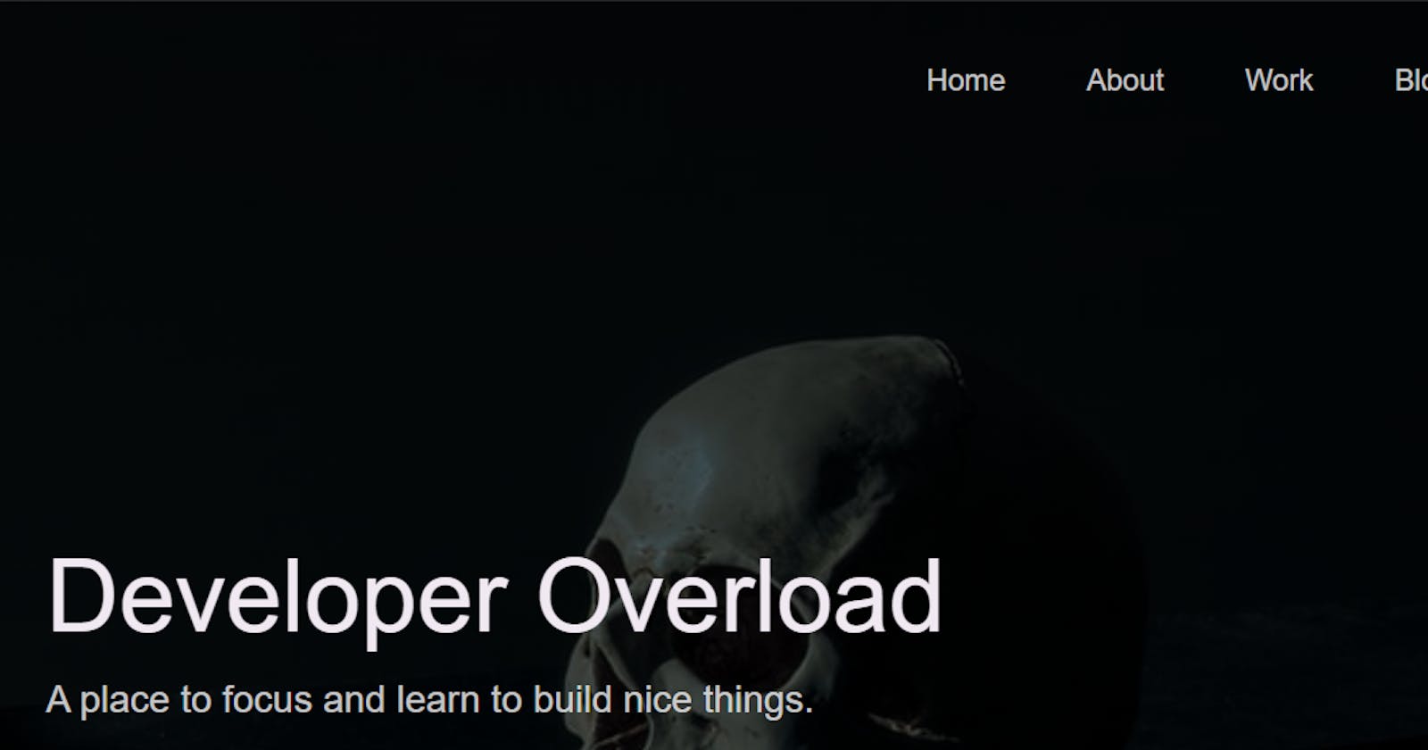


Holidays are almost to an end, and so is this year! Let's finish it out on a good note by finishing the first complete iteration of our personal blog/portfolio site. We may dive in to some particularly interesting sections here, mainly the cards section, as there's a million different ways to display a card these days, but we're going to try to keep it relatively short this round!
Projects
The next section to work on after we finished the header in the previous post is our Projects section. Right now, images aren't correct sizes and nothing is aligned and it looks silly.
So, let's take inventory of what we have to work with again:
<h2>
<h3>
<p>
<ul>
<li>
<a>
<img>

.work
.row
.work_cards
.work_card
.work_text
.tech_stack
.work_links
.link_text
.work_code
.work_image_card
.work_image
As you'll notice, some of these have been styled and will inherit the styles we applied previously. So, it's not as bad as it might seem!
We'll start with this:
/*=============== WORK ============== */
.work_card {
    display: flex;
    align-items: center;
}

.work_card:not(:last-child) {
    margin-bottom: 25rem;
}

.work_links {
    display: flex;
    align-items: center;
}

.work_text {
    flex: 0 0 30%;
}

.tech_stack {
    list-style-position: inside;
    margin-bottom: var(--gutter-normal);
}

.work_code {
    display: block;
    height: 3rem;
    margin-left: var(--gutter-normal);
    transition: all .3s;
}

.work_code:hover {
    transform: scale(1.2);
}

.work_image_card {
    margin-bottom: var(--gutter-normal);
}
And add in some media queries:
@media(min-width: 901px) {
    .work_image_card {
        flex: 1;
        margin: 0 0 0 10rem;
    }
}

@media(max-width: 900px) {
    .work_card {
        align-items: initial;
        flex-direction: column-reverse;
    }

    .work_code {
        height: 4rem;
    }
}

@media(max-width: 500px) {
    .work_card:not(:last-child) {
        margin-bottom: 20rem;
    }
}
Save your file and now things will start to look a bit cleaner, but still not quite what we want:
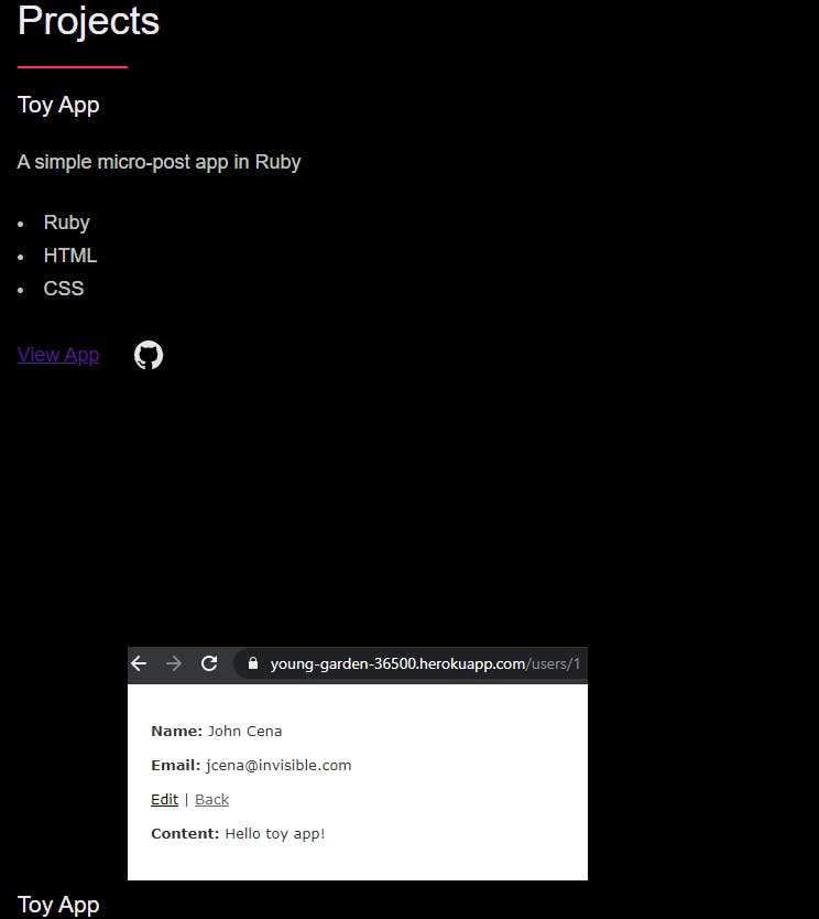
Also note that I went ahead and changed our GitHub image link from the dope octocat to the traditional github icon. I decided it fit better. I think the missing link to really make this section line up properly and look nice is styling the text, buttons and links, so we'll go ahead and work on that.
/*=============== BTNS & LINKS ============== */
a {
    color: var(--white);
    font-weight: 400;
    font-family: var(--font-stack);
    transition: all .2s;
    outline: 2px solid transparent;
}

button:focus,
a:focus {
    outline: 2px solid var(--pink);
}

body:not(.user-is-tabbing) button:focus,
body:not(.user-is-tabbing) a:focus {
    outline: none;
}

.link:hover {
    color: var(--pink);
}

.btn {
    position: relative;
    display: inline-block;
    padding: 1rem 4.2rem;
    text-decoration: none;
    color: inherit;
    border: 1px solid var(--pink);
    font-weight: 400;
}

.btn:focus {
    outline: none;
}

.btn::after {
    content: '';
    display: block;
    position: absolute;
    top: 0;
    left: 0;
    right: 100%;
    background: var(--white);
    height: 100%;
    z-index: -1;
    transition: all 0.2s cubic-bezier(1, 0.68, .016, 0.9);
}

.btn:hover::after,
.btn:focus::after {
    right: 0;
    background: var(--pink);
}

.btn--pink {
    background: var(--pink);
    transition: all 0.2s;
}

.btn--pink::after {
    display: none;
}

.btn--pink:hover,
.btn--pink:focus {
    background: transparent;
}

.link_text {
    position: relative;
    display: inline-block;
    padding: .6rem;
    color: inherit;
    text-decoration: none;
    border-bottom: 1px solid var(--pink);
}

.link_text::after {
    content: '';
    display: block;
    position: absolute;
    top: 0;
    left: 0;
    right: 100%;
    background: var(--white);
    height: 100%;
    z-index: -1;
    transition: all 0.2s cubic-bezier(1, 0.68, 0.16, 0.9);
}

.link_text:focus {
    outline: none;
}

.link_text:hover::after,
.link_text:focus::after {
    right: 0;
    background: var(--pink);
}

.link_text span {
    padding-left: 1rem;
    font-family: sans-serif;
}
Now we're starting to look pretty nice!
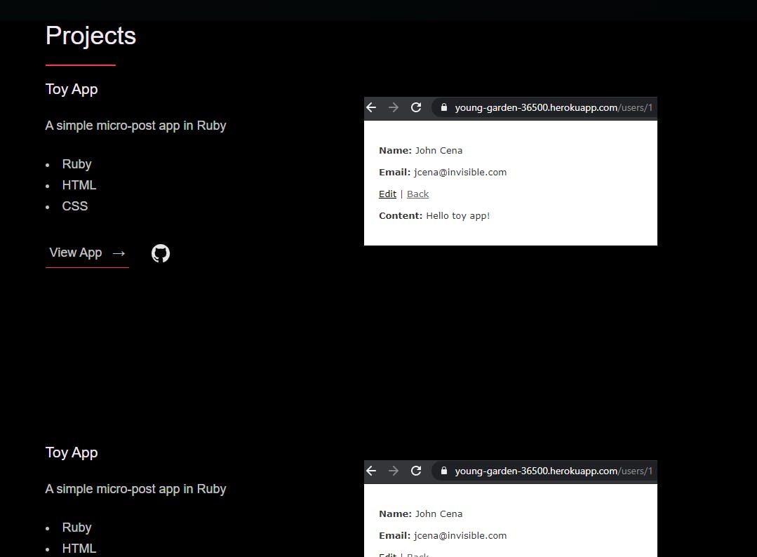
If you look back at our previous work, you'll see we're re-using some of the ideas from before, and combining them to make some neat effects on buttons while also aligning our content to fit the pages better. We also removed button outlines when a user rolls their mouse over a button.
The About section is rather simple, so we'll throw this up real quick:
/*=============== ABOUT ============== */
.about_content {
    display: flex;
    flex-direction: row-reverse;
    align-items: center;
}

.about_photo_container {
    margin-bottom: var(--gutter-normal);
}

/*=============== MEDIA QUERIES ============== */

@media(max-width: 900px) {
    .about_content {
        flex-direction: column-reverse;
        align-items: initial;
    }
}

@media(min-width: 901px) {
    .about_text {
        flex: 0 0 35%;
    }

    .about_photo_container {
        flex: 1;
        margin: 0 var(--gutter-huge) 0 0;
    }
}
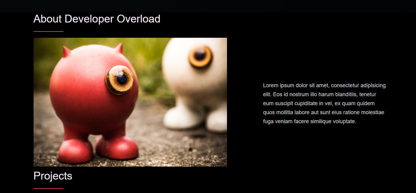
Now we have this nice little about section where you can easily place a picture of yourself and a little information about you or your site:
I'd also like to have some clear separation between the sections, so let's fix that real quick.
section {
    padding: var(--gutter-huge) 0;
    border-bottom: var(--border-light);
}
This is much better:
We've added enough padding to organize it and a little border line for separation. We can do a lot more with that later if we wanted to.
Now we've got two final sections: The Blog and the Footer. We could easily copy the styles from the work section and apply it to the blog, but I'd like to make this a bit different with a neat card design for each article, so we'll do that. In a different iteration of the site, we'll set it to auto-populate based on most recent articles. For now, we'll hard code some articles in to there.
To make this part a bit less time consuming, particularly as a lot of things will be changing when we make the eventual switch to Gatsby, we're taking a short cut and borrowing a card design I really liked from Booligoosh. The only changes I've made are:
Removed the <section class="info>
Changed <class="cards-wrapper"> to <class="blog"> (Not necessary, but helps keep to our needs for naming purposes)
Removed background: #fafafa; from the body {} CSS, as it interferes with our styles.
Removed <div class="num"> from each card-grid-space as we don't need those giant numbers above the cards.
Finally, I replaced the filler text with info for our own blogs, with a final look being:
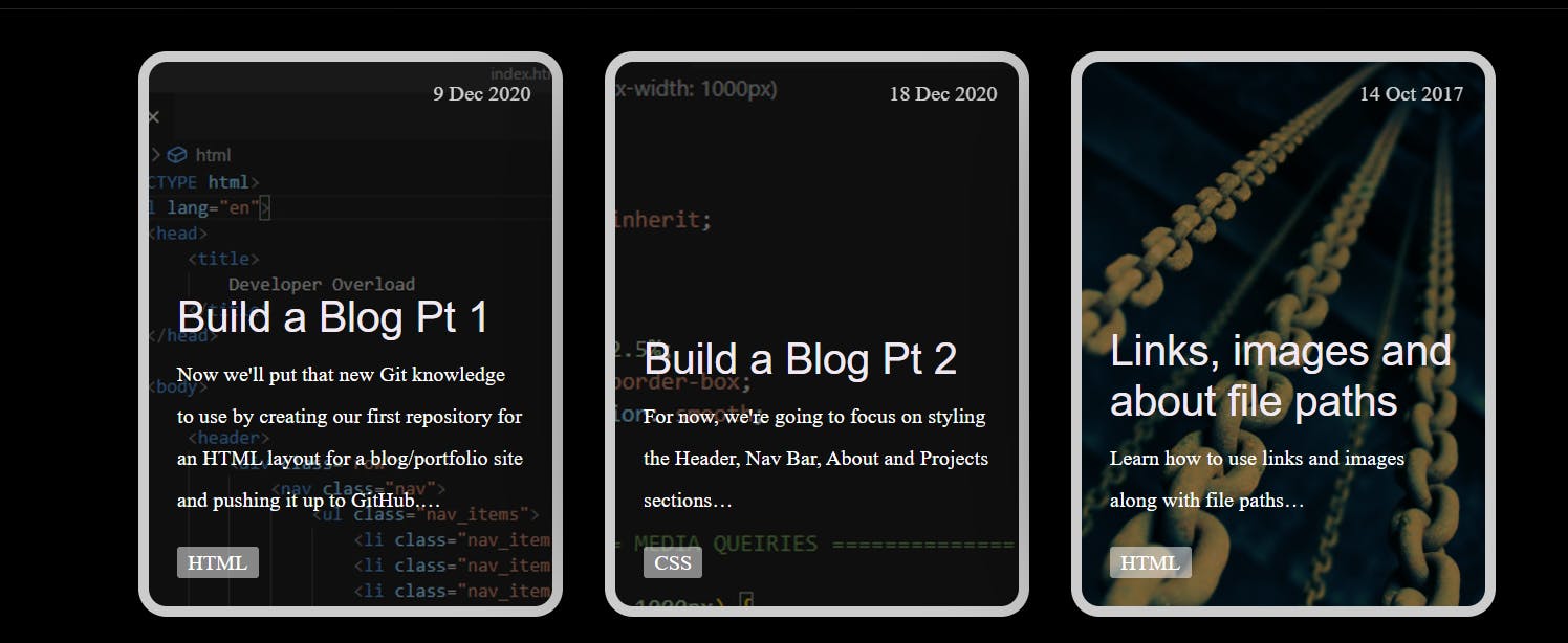
I will be updating that last card with... * drumroll: This blog post when we are done!
These cards keep to what we wanted: They use plain HTML/CSS and are responsive.
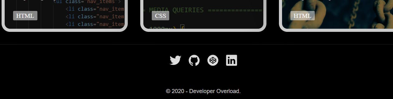
For the footer, I'm a fan of columned footers, but since our current site is rather small, we're going to implement a very minimal one for now.
<footer>
<div class="row">
<!-- Update the links to point to your accounts -->
<ul class="footer_social_links">
<li class="footer_social_link_item">
<a href="https://twitter.com" title="Link to Twitter Profile">
<img src="./assets/images/twitter.svg" class="footer_social_image" alt="Twitter">
</a>
</li>
<li class="footer_social_link_item">
<a href="https://github.com/" title="Link to Github Profile">
<img src="./assets/images/github.svg" class="footer_social_image" alt="Github">
</a>
</li>
<li class="footer_social_link_item">
<a href="https://codepen.io/" title="Link to Codepen Profile">
<img src="./assets/images/codepen.svg" class="footer_social_image" alt="Codepen">
</a>
</li>
<li class="footer_social_link_item">
<a href="https://www.linkedin.com/">
<img src="./assets/images/linkedin.svg" title="Link to Linkedin Profile" class="footer_social_image" alt="Linkedin">
</a>
</li>
</ul>
<p>
© 2020 - Developer Overload.
</p>
</div>
</footer>
And the accompanying styles:
/*=============== FOOTER ============== */
.footer {
    text-align: center;
    padding: var(--gutter-medium) 0 var(--gutter-normal);
}

.footer_social_links {
    display: flex;
    justify-content: center;
    padding: var(--gutter-normal) 0;
    list-style: none;
}

.footer_social_link_item:not(:last-of-type) {
    margin-right: var(--gutter-small);
}

.footer_social_image {
    height: 4rem;
}
And with that, a very simple footer with links to social media and other works:
From here, the site is at a good point to call it completed. Some nice-to-haves that I may implement in the near future before moving on to a Gatsby build would be a "Back to Top" button, and a contact modal, as I've realized we did not work on the contact section that is listed in the Navigation. Keep an eye out for a future post where we'll add a little JavaScript to make both of those happen, as well as how we'll connect it to Netlify for free, easy to implement, static page hosting.